The Artists Who Give a Drawn Line Its Final Force
A contour can become heavier as it turns away from light, dissolve into a shadow, or break just enough to suggest worn cloth. Those choices are part of inking, and they can change how a comics page feels before the reader identifies a single technique. The greatest comic book inkers interpret a drawing through line, black shape, texture, and selective detail. This article highlights seven outstanding practitioners through specific collaborations: Joe Sinnott, Terry Austin, Klaus Janson, Tom Palmer, Dick Giordano, John Totleben, and Scott Williams. It is a considered editorial selection rather than a definitive numerical ranking. The aim is to make their contributions visible without confusing them with pencils, colors, or lettering. Once you see the decisions an inker makes, a familiar page can reveal another layer of authorship.
A: No. This limited selection provides contrasting entry points rather than an exhaustive verdict on the profession.
A: Some projects use loose layouts, leaving considerable drawing to the finisher.
A: Weight affects volume, depth, emphasis, and separation between forms.
A: It uses tapering strokes to create a transition or suggest form and shadow.
A: Texture can be highly organized when visual hierarchy remains clear.
A: No. His inking collaborations include substantial work over Jack Kirby and other pencilers.
A: A verified stage comparison makes specific interpretive choices visible.
A: Yes. The role is defined by visual interpretation rather than one mandatory physical tool.
A: Reduction, scanning, and printing can change fine details.
A: Compare credited work with different collaborators and observe what adapts to each drawing.
Inking Begins Where Interpretation Is Still Open
The division between penciling and inking changes from one project to another. Some penciled pages specify almost every visible detail; others offer looser layouts that leave considerable drawing to the finisher. Even a tightly indicated line still requires decisions about thickness, taper, texture, and its relation to surrounding marks. A printed comic usually cannot preserve every soft graphite nuance in its original form. The inker helps translate the drawing into a visual language that can survive reproduction and guide the reader through a sequence.
Calling this process tracing overlooks judgment. A contour is not isolated from the body it describes, and a patch of black must participate in the whole panel. Too many competing marks can make a scene difficult to read, while removing the wrong detail can destroy a useful expression. The practitioners selected here show different ways to solve such problems. Their greatness should be assessed through the relationship between a collaborator’s drawing and the finished storytelling, rather than through one universal preference for smooth lines or rough energy.
Joe Sinnott Gave Fantastic Four Sculptural Clarity
Joe Sinnott’s long association with Fantastic Four, particularly his collaboration over Jack Kirby’s pencils, makes him a foundational study in superhero inking. Kirby’s powerful bodies, machinery, and extreme action already possess extraordinary design. Sinnott’s contribution helps give those designs a lucid surface: forms remain forceful while their contours and internal marks become exceptionally assured. Marvel’s Fantastic Four #48 credits identify him as the issue’s inker, while interviews with Sinnott supply further context about his practice. The visual achievement is easiest to appreciate in the relationship between solidity and motion. A powerful figure can feel substantial without becoming stiff, and a crowded invention can remain readable without losing its extravagant identity. Sinnott demonstrates that finish can clarify an existing vocabulary while adding a highly distinctive quality of its own.
Terry Austin Made Precision Dramatic
Terry Austin’s work with John Byrne on Uncanny X-Men is a celebrated example of precision serving energetic storytelling. Clean contours, controlled feathering, and clearly separated forms help complex bodies and settings stay readable during action. That control is not a demand that every surface look polished in the same way. It depends on knowing which marks describe form, which establish texture, and which can be left out. A crisp silhouette makes a small figure legible before the reader has studied the finer details.
Marvel’s discussion of the X-Men creative team’s synergy names Austin’s inking alongside the writing, pencils, lettering, and colors. The point is worth preserving because a much-loved run is a coordinated achievement. Austin’s contribution helps a page retain clarity across large emotional changes, from conversation to spectacle. Looking at that consistency offers a better explanation of his importance than simply calling the lines neat. Neatness is a surface impression; disciplined control of attention is the storytelling accomplishment beneath it.
Klaus Janson Makes Black Shapes Carry Pressure
Klaus Janson’s collaborations with Frank Miller, including Daredevil and The Dark Knight Returns, reveal a different kind of force. Broad dark areas, roughened textures, and sharply chosen edges can make a scene feel abrasive and urgent. The page does not need an equal amount of information everywhere. Some forms can emerge from a heavy surrounding darkness, while others are defined by a brief stroke or by the white left between black areas.
That selectivity affects rhythm. A dense passage may slow the eye, and a sudden open shape can release it. Darkness can conceal an approaching threat or compress the space around a body. Such effects belong to the arrangement of the panel and its neighbors, so they should not be judged solely as isolated brushwork.
DC’s Janson credit listing identifies Dark Knight material among his work. It offers a concrete entry point for studying his part in a familiar collaboration. The comparison with Austin is instructive without requiring a winner: precision can create tension, and a more broken or textured surface can create a different tension. The useful question is which approach serves the particular drawing and the scene’s intended experience.
Tom Palmer Turned Atmosphere Into Readable Form
Tom Palmer’s work over Gene Colan on The Tomb of Dracula is an essential example of interpreting a drawing with a strong tonal character. Colan’s forms can seem to emerge from shifting light and shadow rather than from uniformly enclosed contours. Translating that quality into publishable ink requires sensitivity to what should remain suggestive and what needs a firm decision. Palmer could preserve atmosphere while giving figures, clothing, and surroundings the clarity a sequence needs. His collaborations also extend into superhero material, including the Avengers. Marvel’s Kree/Skrull War collection credits explicitly list him among the inkers, reminding readers that collected volumes may combine several teams. Palmer’s inclusion here rests on his ability to accommodate the drawing’s tonal imagination without allowing the finished page to lose its structural purpose.
Dick Giordano Balanced Elegance and Narrative Economy
Dick Giordano’s inking, including collaborations with Neal Adams, offers a compelling study of graceful figure work made clear through selective finish. A face, a fold, or the curve of a shoulder needs to remain connected to an expressive whole. An inker can sharpen those relationships without turning every small passage into an exhibition of technique. Giordano’s work rewards attention to the amount of information a line carries. A controlled change of weight can give a body volume while keeping a panel’s overall design open.
His influence also extended through editorial work and professional mentorship, although those contributions should not replace close attention to the pages themselves. The Inkwell Awards’ Giordano recognition provides an industry account of his importance and influence on other inkers. That influence is useful evidence of a shared craft vocabulary: artists learn not only individual marks but ways of deciding what a collaborator’s drawing needs. Giordano belongs in this selection for both his accomplished finish and the continuing value of that interpretive example.
John Totleben Made Texture Feel Organic
John Totleben’s collaboration with Stephen Bissette on Swamp Thing shows how texture can become more than surface decoration. Vegetation, bodies, and uncanny transformations ask the page to distinguish several kinds of matter while allowing them to mingle disturbingly. Fine marks, dense patterns, and areas of black can make an environment feel alive. The challenge is to preserve hierarchy inside that abundance. DC’s account of the series’ creative breakthrough places Totleben beside Bissette and colorist Tatjana Wood. Keeping those names together does not make their roles identical. It shows that the work’s particular atmosphere results from relationships among contributions. Totleben’s example is valuable for any reader tempted to measure inking only by the cleanliness of an outline: a textured line can be disciplined, expressive, and indispensable to the story.
Scott Williams Gives Dense Drawing a Controlled Finish
Scott Williams’s long collaboration with Jim Lee, including Batman: Hush, is a prominent modern example of detailed superhero drawing interpreted through assured ink. Musculature, costume folds, machinery, and urban environments can all occupy the same panel without needing to compete at the same intensity. The challenge is to make a dense image hold together at ordinary reading size. Fine hatching and strong contours have to remain parts of one arrangement rather than separate demonstrations of effort.
DC’s presentation of Lee’s ICONS cover pencils and Williams’s inks offers a particularly useful comparison. Seeing the stages side by side makes the inker’s contribution easier to examine directly. Notice where a shadow becomes decisive, where a form separates from its surroundings, and how tiny marks join a larger pattern. Williams’s work illustrates the distinction between preserving detail and merely accumulating it. The finished page needs enough structure for the reader to enjoy the detail without losing the action.
Tools Change the Mark, but Judgment Organizes It
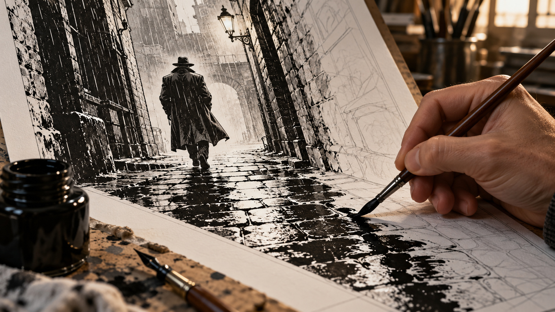
A brush can vary width within one stroke, while a dip pen offers its own kinds of precision and resistance. Technical pens, markers, and digital tools provide further possibilities. None guarantees expressive inking by itself. Pressure, speed, surface, and the artist’s control all affect the resulting mark, but a collection of beautiful strokes can still fail to describe a coherent scene.
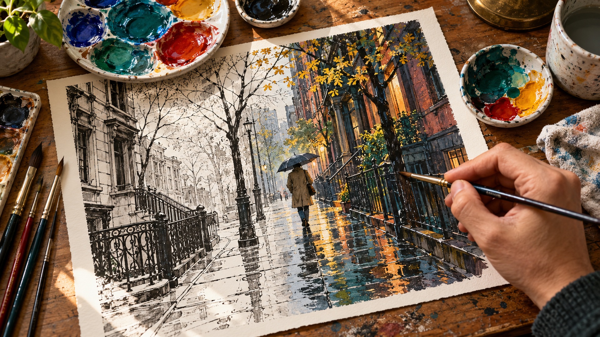
The most useful technical vocabulary therefore connects marks to purpose. Feathering can suggest a transition between light and shadow; hatching can establish tone or texture; a heavy contour can separate a foreground form. White space can be as active as ink when it preserves a highlight or breaks a dark shape. These techniques are not compulsory decorations. They become meaningful through the information they carry.
Digital inking also complicates the old idea that authentic work must leave one particular physical object behind. The relevant question is how the final image interprets the drawing and how well it reproduces for its intended format. A scanned traditional page and a digitally inked page may both undergo production changes before publication. Readers can appreciate material differences without turning tools into a substitute for evaluating the work.
How to Compare Inks Without Inventing a Contest
When genuine pencil-and-ink comparisons are available, begin with the overall silhouette and the distribution of large black areas. Then look at smaller decisions around faces, hands, cloth, and background edges. Some changes may be required by the reproduction process; others reveal a personal interpretation of form. The comparison should describe those changes before declaring them improvements or losses. Without the pencils, avoid assigning every visible feature to the inker solely from memory or reputation.
A collected edition needs similar care because its contributor list may span several issues, covers, and visual roles. Confirm the specific page or story being discussed. A name under a broad database category such as artist does not always identify the exact production stage. Good credit practice makes criticism more precise and prevents admiration from attaching to the wrong contribution. It also leaves room to notice how a penciler and inker can produce different results with different partners.
Follow a Collaboration, Then Follow the Inker
These seven practitioners demonstrate a wide range of solutions: sculptural clarity, crisp precision, abrasive darkness, tonal atmosphere, elegant economy, organic texture, and controlled detail. The descriptions are points of entry rather than permanent limits on anyone’s range. Choose a credited collaboration, read several pages, and notice how consistently the visual decisions support the scene. Then find another project by the same inker and watch what changes with a new collaborator. That movement between continuity and adaptation is one of the craft’s great pleasures. Inking becomes easier to value when it is understood as an active negotiation with a drawing, a printing process, and another person’s story, carried out one consequential mark at a time.