The Same Drawing Can Tell a Different Story in Color
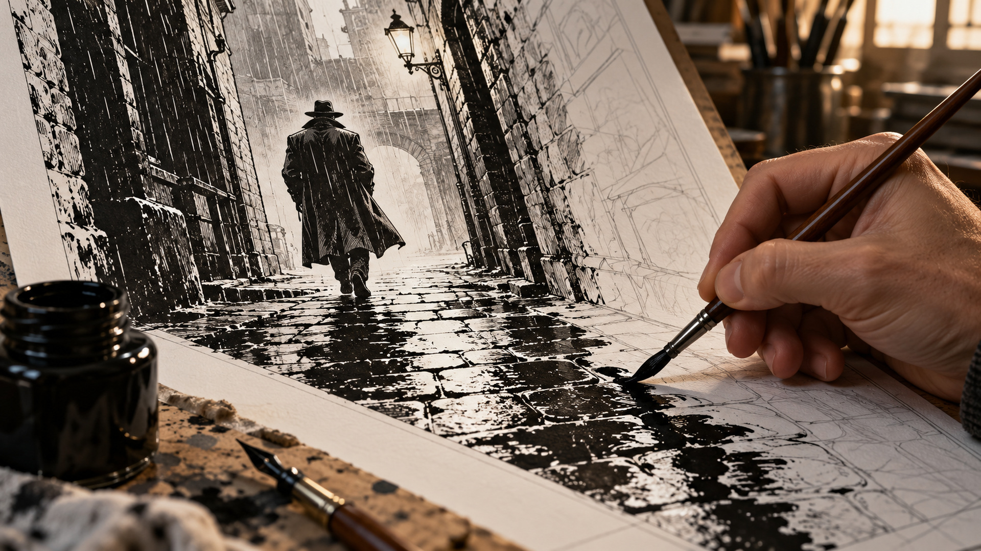
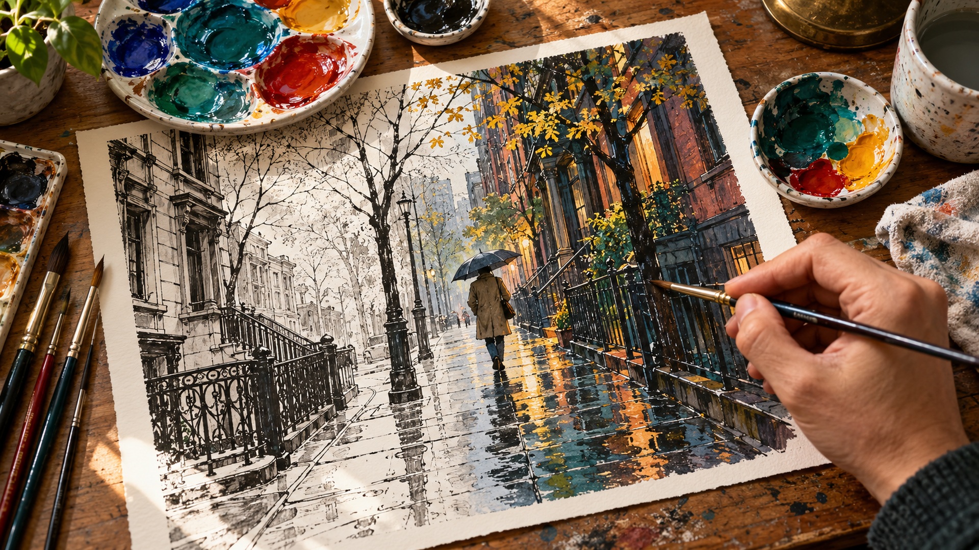
Imagine a comics panel showing someone waiting outside a closed doorway in the rain. The drawing establishes the posture, the architecture, and the falling water, but it leaves several possibilities open. A warm light escaping beneath the door might promise refuge; a cold pavement reflecting a distant red glow might suggest danger; a subdued palette might make the same pause feel weary rather than frightening. The colorist helps choose what the reader experiences first and how that experience connects with the surrounding panels. This work is neither decorative cleanup nor an automatic reward added after the real storytelling ends. It is a series of judgments about attention, atmosphere, space, continuity, and reproduction. Following a page through those judgments makes the finished comic easier to appreciate, especially when its colors work so smoothly that readers never consciously notice the decisions guiding their eyes.
A: Usually it establishes selectable regions; the temporary colors need not be the final artistic choices.
A: Yes. Teams divide the production tasks differently.
A: It helps reveal value relationships that may be hidden by appealing hues.
A: No. Flat, graphic, restrained, and highly modeled approaches can all serve different comics.
A: That depends on the team's creative agreement and production process.
A: Their value depends on whether they clarify the intended action and attention.
A: Repeated relationships teach readers how a location or moment should feel.
A: Emitted screen light and reflected printed color behave differently.
A: Yes. New value and palette decisions can alter emphasis even when the drawing stays the same.
A: Check the issue's credits and distinguish coloring from flatting and other production roles.
Read the Sequence Before Choosing the Palette
The first useful task is understanding the scene. A colorist needs to know where the characters are, what has just happened, and what the next page will reveal. A panel that looks like an isolated landscape might actually be the pause before an ambush. Treating it as a beautiful postcard could weaken the intended transition, even if every individual color looks attractive.
This means reading across panels and often across an entire issue. Recurring locations may need recognizable palettes, while a dream, flashback, or change of time can require a different visual treatment. The script, artwork, editorial guidance, and conversations with collaborators provide information, but they do not mechanically determine every choice. The colorist interprets those materials and proposes a coherent way for the sequence to feel.
Prepare the Lines Without Erasing Their Character
Production usually begins with a suitable image file containing the finished drawing. The exact workflow varies: some teams use scanned ink, others digital lines, and some publish painted work that does not separate neatly into traditional stages. Resolution, page dimensions, trim, and safe areas need attention early. A beautiful color pass cannot repair a file that was prepared at the wrong size without additional work.
Keeping the drawing on an appropriate layer allows color underneath while preserving its contours. Cleaning dust from a scan is different from redesigning an artist’s marks. A dry-brush edge, open contour, or expressive scratch might be intentional, so the colorist must understand what belongs to the artwork before treating it as an error. Communication prevents technical cleanup from quietly changing another contributor’s decisions.
Line treatment can itself become part of the collaboration. Some outlines remain black; others may be tinted to help mist, distance, light, or a softer material read naturally. Such changes require restraint because line weight already carries information. The aim is to make the intended world legible while respecting the visual vocabulary that the penciller and inker, or a single artist handling both jobs, have established.
Flats Build a Map That the Eye May Never See
Flatting divides the artwork into selectable regions, such as a coat, a wall, a face, and the ground behind them. These initial colors may be practical markers rather than the finished palette. Accurate selections make later work more controllable: the colorist can alter a jacket without repainting the adjacent hand or background. A separate flatter sometimes performs this specialized production work, while other colorists handle it themselves. Neither arrangement makes the stage creatively meaningless or interchangeable with finished rendering. It is useful to think of flats as an editable map whose boundaries support the choices that follow, including revisions requested after the first complete pass.
Value Establishes a Hierarchy of Attention
Before considering whether an object should be blue or green, ask how light or dark it should appear relative to nearby shapes. This relationship is called value. A pale face against a dark doorway can remain immediately readable even when the palette is restrained. Two highly saturated colors may still merge confusingly if their values are too similar at the size of the published panel.
Colorists can check the page in grayscale to inspect this structure, although grayscale is a diagnostic aid rather than a complete substitute for seeing color. The important issue is hierarchy. A background can contain rich detail without demanding the same attention as the character’s reaction. If every surface receives equal contrast and equally bright highlights, a technically elaborate page may become tiring and difficult to follow.
Palettes Give Places and Moments Their Own Logic
A palette is a working relationship among colors, not simply a list of favorites. The rainy street might combine slate blue surroundings with a small amber doorway. That difference can establish the door as a destination before a caption explains it. Another scene might deliberately reduce this separation, making a character feel trapped within an environment rather than clearly outlined against it.
Consistency makes these decisions meaningful. If a kitchen has felt warm and ordinary for several scenes, a sudden sickly tint can register as a disturbance. The change does not have to be realistic in a photographic sense to be clear in narrative terms. Readers learn a book’s visual rules through repetition, so an exception can carry emotional weight when it appears at a purposeful moment.
Different colorists and projects make different bargains with naturalism. A muted crime story, a brightly graphic adventure, and an intimate autobiographical comic need not share the same approach. Marvel’s discussion of colorists’ influences illustrates practitioners appreciating varied methods and effects. These are artistic alternatives shaped by the drawing and story, rather than steps on a ladder toward one universally superior level of realism.
A practical palette reference can preserve these relationships when pages are completed out of sequence. Returning to the rainy street several scenes later should not require reconstructing every earlier choice from memory, particularly when more than one person handles the production. Keeping reference separate from a rigid formula also leaves the colorist free to change the atmosphere when the story supplies a reason, such as a familiar place becoming unexpectedly unsafe.
Lighting Explains Form and Changes the Stakes
Once the broad relationships work, light and shadow can describe volume, material, weather, and direction. A sharp edge of sunlight suggests a different surface and atmosphere from diffuse illumination through cloud. On our rainy street, reflections may connect the foreground to an off-panel light source, telling the reader that something exists outside the visible frame. The challenge is keeping this information consistent enough to support the drawing without making the lighting a competing spectacle. A deliberately flat style can be the right solution; elaborate modeling is a choice, not a requirement that every professionally colored page must satisfy.
Special Effects Need a Narrative Job
Glows, motion accents, haze, sparks, and transparency can make extraordinary events readable. Their usefulness depends on what they clarify. A restrained rim of reflected light might explain that a weapon is dangerously hot, while a broad bloom might obscure the hand holding it. The colorist has to decide which fact matters most in the panel and preserve that fact through the effect.
Effects also need to survive the surrounding sequence. If every entrance is treated as a blinding revelation, a truly important arrival loses distinction. A quieter panel can prepare the eye for an intense one, just as silence can prepare a dramatic sound. This rhythm is one reason a strong page cannot be judged solely by enlarging its most impressive panel and ignoring what comes before and after.
Work Around Balloons, Faces, and Page Turns
Lettering and color interact even when they are completed at different points in production. A white balloon is a large bright shape that can change the page’s balance. Darkening every space around it may give the words more force than intended, while a nearby effect can reduce contrast around a caption. Reviewing the assembled page helps reveal problems invisible in an unlettered color file.
Faces and hands deserve particular care because readers use them to interpret intentions. A plausible shadow may still hide the expression the scene depends on. Sometimes a slightly adjusted local value communicates the performance better than strict physical realism. The same principle applies to a small object being passed secretly between characters: visibility must serve the story the collaborators have agreed to tell.
Page turns introduce another level of timing. An unexpected palette after a turn can signal a new location, a sudden emergency, or a psychological shift. Coloring every page independently risks weakening these larger relationships. Looking at spreads and sequences allows the colorist to balance continuity with surprise, including the contrast between a crowded action page and the calm image that follows it.
Reproduction Is Part of the Art
A display emits light, while printed paper reflects it, so a color that seems luminous on a monitor may behave differently in a physical comic. Paper stock, printing process, color profile, and the publisher’s specifications all affect the result. Colorists and production staff therefore prepare and check files for their actual destination rather than trusting screen appearance alone. This does not mean that every file follows one universal conversion recipe: the correct workflow depends on the production requirements. Proofing can reveal muddy shadows, lost distinctions, or unexpectedly weak effects before those problems reach the reader, and it should be treated as part of finishing rather than clerical work after the art is complete.
Revisions Bring the Team’s Intentions Together
An editorial revision might address continuity, a missed story detail, a printing problem, or a different interpretation of the mood. Useful feedback names the problem instead of merely asking for more excitement. If the reader must notice the dropped key, the discussion can focus on contrast and placement around that object. Increasing saturation across the entire page might make the key even harder to find.
The best workflow leaves room for this conversation without assuming that every disagreement indicates failure. Writers, artists, letterers, editors, flatters, and production staff see different aspects of the same page. A colorist can explain why an apparently unusual choice supports a later scene, or discover that an important detail was not visible in the supplied material. Clear credits and respectful communication help preserve the collaboration behind the result.
Learn to See the Colorist’s Contribution
On a second reading, follow the largest color changes instead of only following the dialogue. Look for repeated accents, shifts in temperature, and moments when the background becomes simpler around an expression. Ask whether a location remains recognizable under different lighting and whether the most dramatic effects appear at meaningful points. These observations make criticism more precise than calling a book bright, dark, realistic, or stylish.
Reading credits can then connect those effects to the people responsible. The colorist’s contribution belongs beside the drawing and writing in any account of how the finished page communicates. A successful palette does not merely make an already complete story prettier; it helps determine what the reader notices, how space is understood, and what emotional possibilities the scene carries. The doorway in the rain becomes welcoming, threatening, or uncertain through choices someone actually made.
A useful comparison is to study two editions of the same older comic when recoloring has been credited. Keep the drawing fixed in your attention and observe what changes around it. A modern treatment may introduce softer transitions, new atmospheric depth, or different emphasis on a figure, while an earlier version may communicate through bold separations and limited resources. Neither should be judged simply by counting available effects. Ask what each version makes easier to read, what it makes more prominent, and whether a change serves the original sequence or creates a new interpretation. This comparison also reveals why production history belongs in discussions of visual style: a color choice is made for particular tools, paper, processes, and readers. When those conditions change, an apparently simple replacement can become a substantial artistic decision. The colorist is interpreting the drawing within that setting, and the reader benefits from recognizing the difference between faithful reproduction, technical repair, and a deliberately fresh visual approach.