A Great Comics Team Is Larger Than Its Shortest Credit
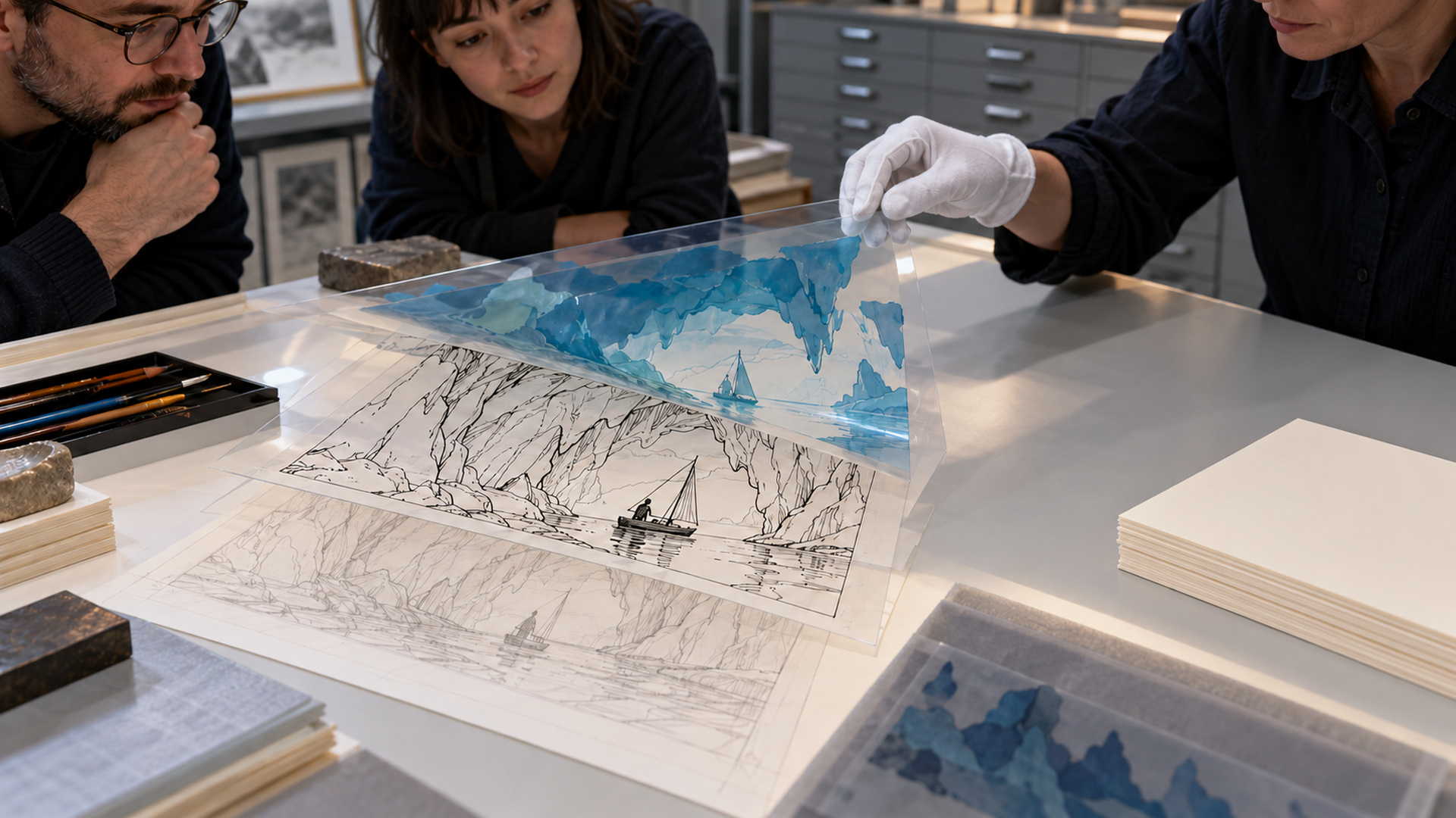
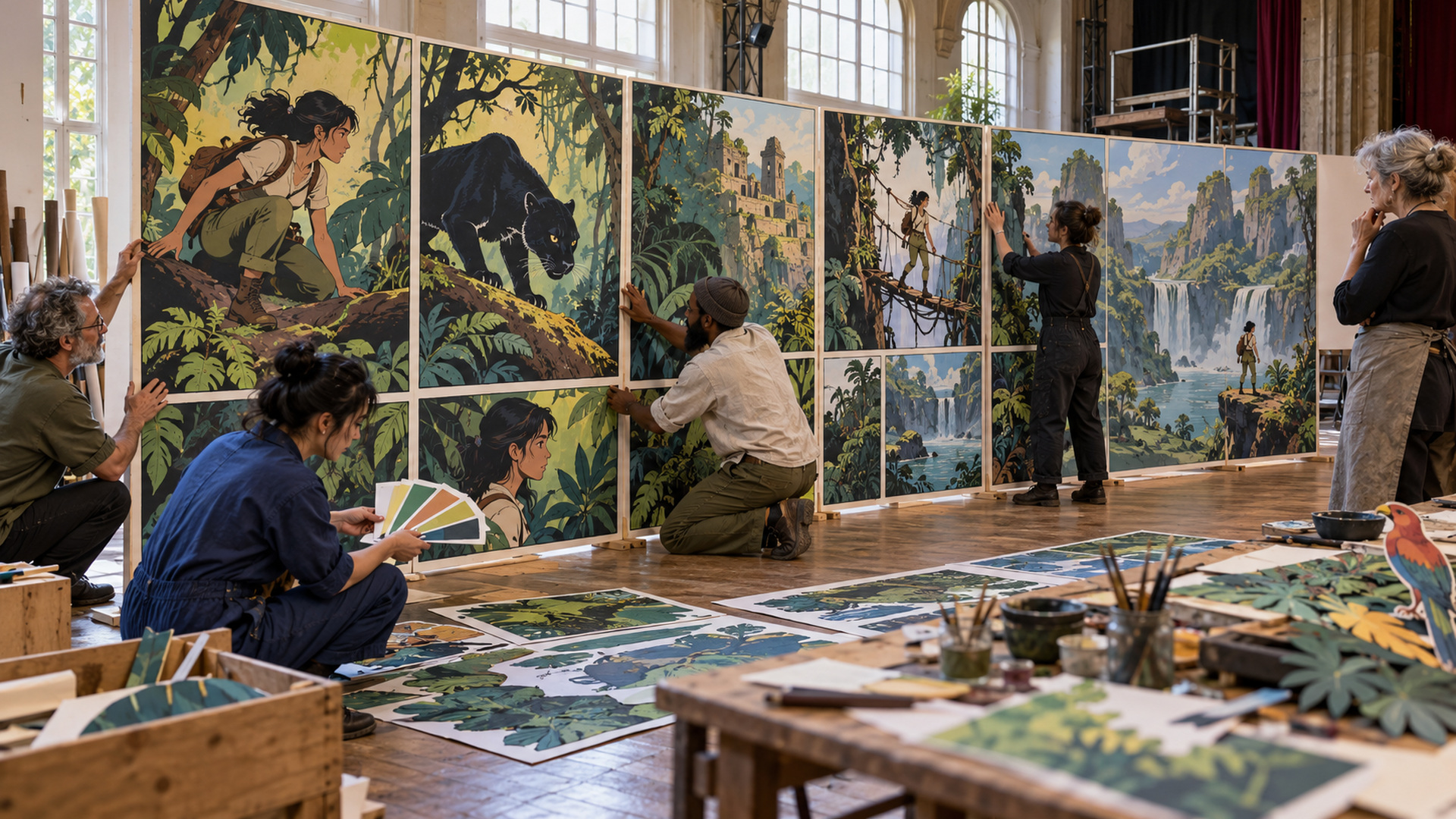
A reader may remember a book as the work of one writer and one artist, yet the page that made the memory can depend on a particular inker, colorist, letterer, and editor working in concert. The greatest comic book creative teams turn those contributions into a coherent reading experience without making them interchangeable. This selection examines five exceptional ensembles associated with Watchmen, Uncanny X-Men, The Sandman, Ms. Marvel, and Saga. They are editorial choices from a much wider history, with an emphasis on how different responsibilities reinforce one another across sustained work. No score can make their achievements directly equivalent, and no short roster represents every contributor to a long-running title. Looking carefully at the whole ensemble offers something more useful than a battle between famous pairs: an account of how several distinct kinds of judgment can make one comic feel unmistakably itself.
A: A series can preserve purpose through changing collaborators, as Sandman's range demonstrates.
A: Its lettering and presentation help form the recognizable book readers actually encounter.
A: No. One person can coordinate two responsibilities while each remains identifiable.
A: Wilson's dialogue, Alphona's acting, Herring's emphasis, and Caramagna's placement must preserve the same uncomfortable human moment.
A: Color and lettering contribute to the clarity and identity of the finished sequences.
A: It concerns coordination and judgment rather than an automatic claim to all authorship.
A: Describe its effect on the specific story before treating resemblance to the old arrangement as the only standard.
A: Coherence depends on coordinated decisions rather than headcount alone.
A: It reveals acting, pacing, hierarchy, and verbal navigation without relying on spectacle.
A: The Vaughan–Staples partnership and Fonografiks's continuing lettering and design give sharply different emotions a shared visual framework.
Judge the Coordination, Not Just the Collection of Names
Several individually excellent practitioners do not automatically produce an excellent collaboration. The work has to accommodate their strengths: a script needs room for visual acting, detailed drawing needs an intelligible color hierarchy, and dialogue must fit without burying the crucial gesture. Greatness becomes visible when these decisions support a shared dramatic purpose over more than one striking image. That does not require perfect harmony behind the scenes, which cannot be inferred from a finished page. It requires a result in which the reader can move through different kinds of information without feeling that every contributor is demanding attention at once. The evidence is the sequence itself, examined alongside accurate credits and documented accounts of how it was made.
Watchmen: An Integrated Graphic System
Alan Moore, Dave Gibbons, and John Higgins give Watchmen an unusually coordinated identity. Moore’s writing supplies a densely organized story, Gibbons’s drawing and lettering establish a controlled visible structure, and Higgins’s colors help connect scenes and establish atmosphere. The familiar grid is only one part of that coordination. Repeated images, changes of scale, carefully placed words, and meaningful color relationships ask the reader to notice connections without making every connection a verbal explanation.
DC’s Watchmen edition listing identifies the core collaboration and its color contribution. The original series’ editorial history includes Len Wein and Barbara Randall, later known as Barbara Kesel. DC’s remembrance of Wein identifies his work on the series. The edition matters because later reproduction and recoloring histories affect the object a reader is examining. Praise should therefore attach to an identified version rather than an unlabelled image. Gibbons’s dual role is also important: drawing and lettering can be coordinated particularly closely when the same practitioner handles both, but the two responsibilities remain distinguishable.
The team’s strength is not that every element is equally conspicuous. A quiet panel can carry a verbal exchange while a color recurrence prepares a later recognition. A large event can emerge from the same visual rules that govern ordinary conversation. This consistency allows the story to become complicated without losing its graphic foundation. Read several pages in succession and the achievement appears as a system of mutually supporting choices, not merely a collection of clever devices.
Uncanny X-Men: Precision Around an Expanding Ensemble
The Chris Claremont, John Byrne, and Terry Austin collaboration on Uncanny X-Men is famous for good reasons, but it becomes more complete when lettering and color remain visible. Tom Orzechowski’s lettering helps organize substantial dialogue and distinct voices, while Glynis Oliver’s color work contributes to the page’s readability and identity. Marvel’s discussion of the team’s creative synergy explicitly names these contributions. Editors also changed across the run, so the issue credits remain a better guide to a particular installment than a single generalized roster.
This ensemble had to keep a large cast emotionally specific while accommodating action and continuing consequences. Byrne’s visual staging and Austin’s precise finish give bodies and settings clear relationships; Orzechowski’s arrangement of words keeps exchanges navigable; color helps separate information without disconnecting it from the same world. Claremont’s density therefore operates inside a coordinated page rather than simply existing beside pictures. The achievement is easiest to see in a transition from an intimate disagreement to spectacle, where a reader must retain the people inside the event. Sustained collaboration gives these different scales a common vocabulary, allowing a growing serial to feel continuous without requiring every scene to proceed at the same pace.
The Sandman: Continuity Without One Permanent Drawing Style
The Sandman challenges the assumption that a great team must preserve an identical roster or surface style for every issue. Neil Gaiman’s writing works with a changing group of artists, while recurring contributors and editorial stewardship help the series remain intelligible as a larger project. Sam Kieth and Mike Dringenberg belong to its early visual development; later stretches bring other distinctive approaches. Treating every page as the product of one undifferentiated artist would erase one of the series’ defining features.
Todd Klein’s lettering is a particularly important source of continuity. Distinctive voices can remain recognizable even when surrounding drawing changes. His first-person career account places the work within his wider practice of developing lettering styles. The contribution is architectural as well as expressive: a new visual treatment of a character still needs words that guide reading and belong in the page.
Color responsibilities also vary across the series, with Danny Vozzo among its significant continuing contributors. An accurate appreciation should identify the story or edition rather than assign the whole run’s palette to one person. Karen Berger’s editorial association helps explain the project’s publishing continuity, but it does not make her the author of every scene. The ensemble includes both people who make the visible marks and people whose coordination allows changing collaborators to work within the larger undertaking.
The result is a useful model of flexible coherence. A dream, historical episode, or personal encounter can benefit from a different visual vocabulary while remaining part of a recognizable imaginative world. Variation is an artistic resource rather than a production embarrassment. The team’s greatness lies partly in making that variation feel purposeful, so that a reader can welcome a new drawing style without feeling that the series has forgotten itself.
Ms. Marvel: A New Protagonist Needs a Complete Social World
G. Willow Wilson and Adrian Alphona’s Ms. Marvel places Kamala Khan inside an ordinary life that gives the extraordinary events their stakes. Ian Herring’s colors and Joe Caramagna’s lettering, acknowledged in Wilson’s own account of the collaboration, participate in how that life becomes readable, while editors Sana Amanat and Stephen Wacker were part of the character’s development. Jamie McKelvie’s character-design contribution adds another distinct responsibility. These are different contributions to a shared project, not interchangeable claims to every element. The familiar short version of the credit should therefore open into the full issue record. Alphona’s expressive bodies and environments need room for Wilson’s characterization; colors and words must preserve the comedy, anxiety, and social relationships inside those images. The ensemble is especially strong when an awkward civilian moment and an unfamiliar superhero problem feel like pressures on the same person. A new character becomes more than a design when several practitioners make the surrounding world worth returning to, and the team allows the reader to care about the person before treating a public symbol as a settled achievement.
Saga: A Compact Ensemble With a Distinctive Public Voice
Brian K. Vaughan and Fiona Staples anchor Saga, but the recognizable finished object also includes Fonografiks’s lettering and design. Staples handles the visual world across drawing and color, giving the partnership a division of labor different from a traditional pencil-ink-color assembly. Vaughan’s writing and Staples’s visual characterization build a large imaginative setting around personal relationships, while the lettering has to remain clear across unusual creatures, scales, and circumstances.
Image’s published Saga letter-column material explicitly acknowledges Fonografiks’s contributions and points to work beyond the series. That recognition matters because a reader can easily notice a spectacular creature and overlook the graphic system that makes a conversation with it effortless to follow. Design gives the book a recognizable presentation, but presentation should not be confused with the original drawing or the script. Each responsibility adds something particular.
The compact ensemble can sustain a strong identity without requiring every page to perform the same emotional task. Spectacle, affection, absurdity, and grief can coexist because the visual and verbal systems have enough range to shift together. The lesson is not that smaller teams are inherently superior. It is that a successful arrangement uses its available strengths and gives essential decisions clear ownership, allowing the work to change its mood while remaining recognizably the same series.
Changed Credits Can Reveal the Team’s Real Structure
A continuing comic offers an opportunity to observe what changes when one contribution changes. A new colorist may alter atmosphere while the drawing remains similar. A different inker can change texture and weight without changing the underlying composition. A new letterer can modify the reading rhythm of an otherwise familiar exchange. These observations should begin as descriptions rather than as instant verdicts that the earlier version was the only legitimate one.
The replacement can also reveal work that previously seemed invisible. When a returning location feels different, the cause may lie in palette rather than script; when a crowded conversation becomes easier to navigate, the lettering may deserve attention. Comparing credited examples prevents one famous name from absorbing every success or failure. It also makes clear that a team is a working arrangement with history, not simply a brand attached permanently to a cover. The strongest assessment acknowledges change while asking how the new arrangement serves the story now being made.
Editorial Continuity Gives the Collaboration Practical Room
Editorial work becomes easier to understand when attached to a specific demand rather than a vague claim that someone maintained quality. A title moving among artists needs a usable understanding of the next story’s requirements. An ensemble series needs clarity about which emotional consequences continue into a new installment. A book introducing a new protagonist needs agreement about what the surrounding household and community are supposed to make possible. These tasks can affect recruitment, reference material, production conversations, and the sequence of approvals. They shape the work without making the editor the hidden author of everything that succeeds.
The contrast between Sandman and the early Ms. Marvel project is useful here. A series that welcomes different visual approaches needs continuity without suppressing each artist’s contribution. A new lead character needs a social world specific enough to support future stories rather than only an impressive debut. Those are related but distinct editorial problems. Their solutions cannot be inferred simply by placing an admired editor’s name beside the title. Credited issues, interviews, and documented development accounts are better evidence of what a particular person actually contributed and how that contribution changed over time.
Practical coordination also creates room for other people’s strengths. A timely reference can prevent an artist from repeating avoidable research, and a clear decision about an uncertain detail can stop several later stages from proceeding on different assumptions. Such work is rarely the image selected for an anniversary poster. Its importance appears in the conditions under which the visible pages could be made. Recognizing it completes the ensemble picture while leaving the writer’s sentences, the artist’s performances, the colorist’s relationships, and the letterer’s pacing attached to their respective practitioners.
Let the Full Ensemble Become Part of the Memory
These examples invite a different habit of appreciation. Choose an ordinary page rather than only a celebrated climax, identify its actual contributors, and follow how images, words, values, and spaces cooperate. Then read the neighboring pages to see whether the coordination holds across changes of pace. The greatest teams reward that attention because their work supports both immediate pleasure and close examination. A reader can enjoy the story without naming every technique, then return to recognize the distinct judgments that made the experience possible. Remembering more names does not divide the achievement into smaller pieces. It gives the unified result a fuller human history and makes it easier to follow the practitioners whose contributions might otherwise remain hidden behind the two names everyone already knows.